


Modified Watches vs. Fake Watches
Is there a difference?

The Precursor
Re-dials: the scourge of vintage watch hunting. For many buyers, the dial is 80% of the reason they buy a watch, and knowing this, lots of unscrupulous sellers will take patina-ridden, mouldy, or damaged dials and completely repaint them. These re-dials are typically done by hand, so the quality finish you'd expect is rarely there. As a result, a sharp eye can spot them easily. But should they always be avoided? I’m here to make a case for the subtle difference between a modification and a fake redial. But first, let me start with one of Seiko’s best recent dials…
Seiko SARD007 “Riki Watanabe” Enamel
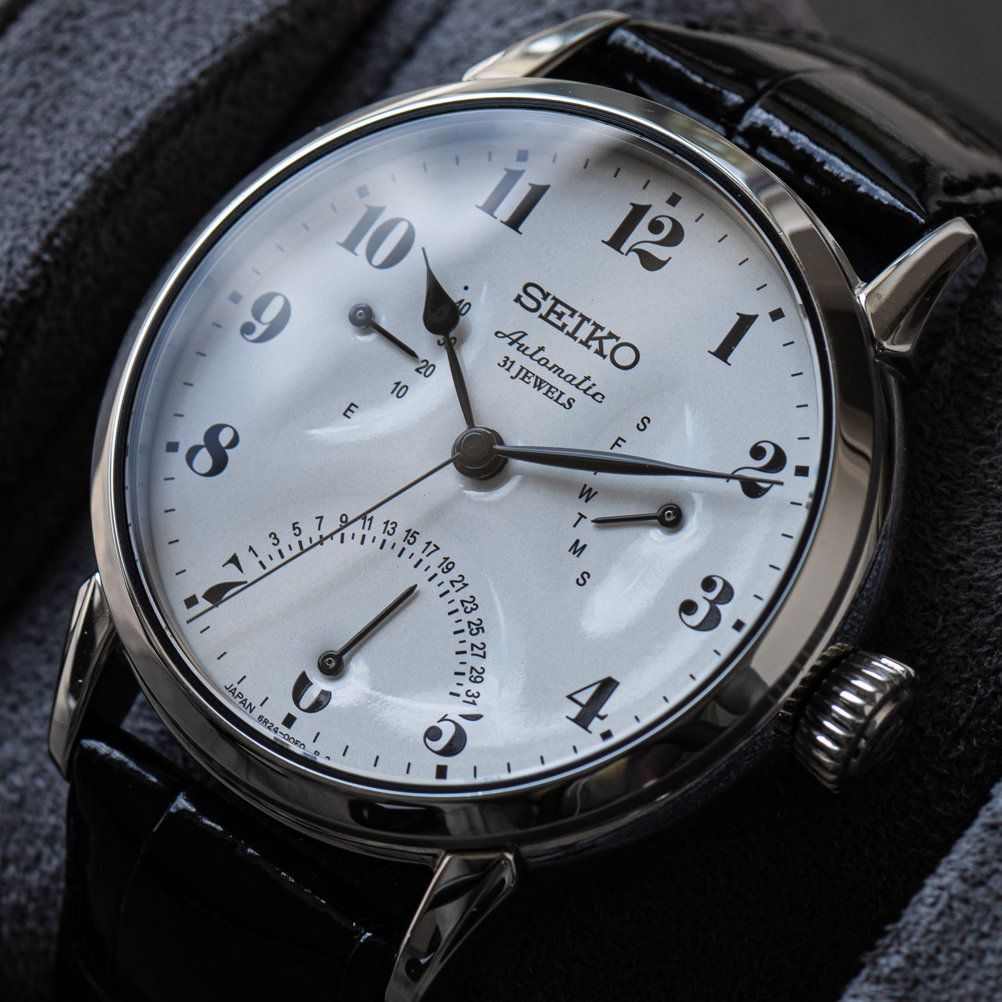
A silky 28,800bph 6R24 double retrograde movement (day and date), with a power reserve indicator at 9 o’clock. A snow-white, enamel dial with pressed subdials, designed to pay homage to the late Riki Watanabe. Often considered a pioneer of modern Japanese design, Watanabe passed away in 2013 and Seiko collaborated with his design house on a handful of enamel dial watches that took inspiration from Watanabe’s famous clock designs. The results are stunning; not only do they perfectly capture the essence of the “Riki Clocks”, but the high contrast visuals and intricate subdials harken back to Seiko’s early “Laurel” days.

Winner of Japan’s 2004 Good Design Award, the “Riki Clocks” have an almost Herman Miller-esque following in Japan’s interior design scene. As a result, the now-discontinued SARD007 is incredibly popular in Japan, and is one of the few Seiko watches that’s typically more expensive to buy in Japan than in the West.
Seiko SARY005
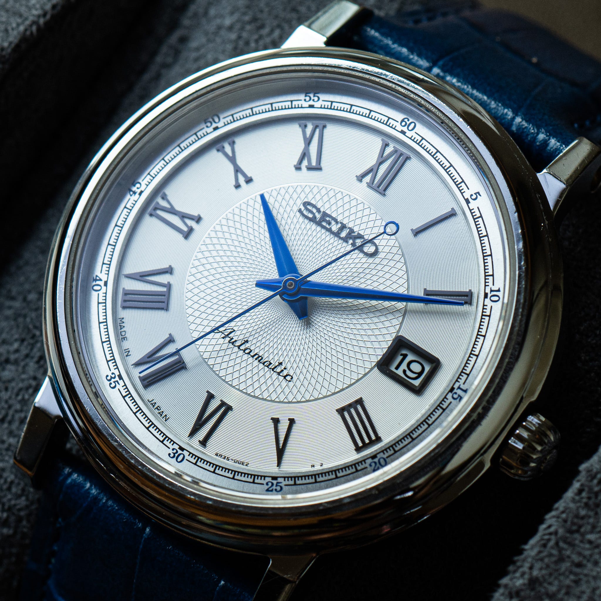
Seiko loves to drop random, unmarketed, dressy-looking watches onto the JDM. They often do it in incredibly limited numbers without any fanfare, making them pseudo-limited edition and very hard to track down. The SCVE “Dot” Series, which is often erroneously thought of as being limited edition, is perhaps the most famous example of this. In reality, Seiko are just a bit whacky, and they love to stylistically experiment with small batch releases.
A guilloché-textured inner circle with tight concentric circles around the outer dial. But, the indices on this watch deserve all of the credit. They do a wonderful job of flicking between dead matte and fully illuminated as the light catches them. It seems very unlikely given the price point, but they have a zaratsu polish look to them!
Seiko SARY007
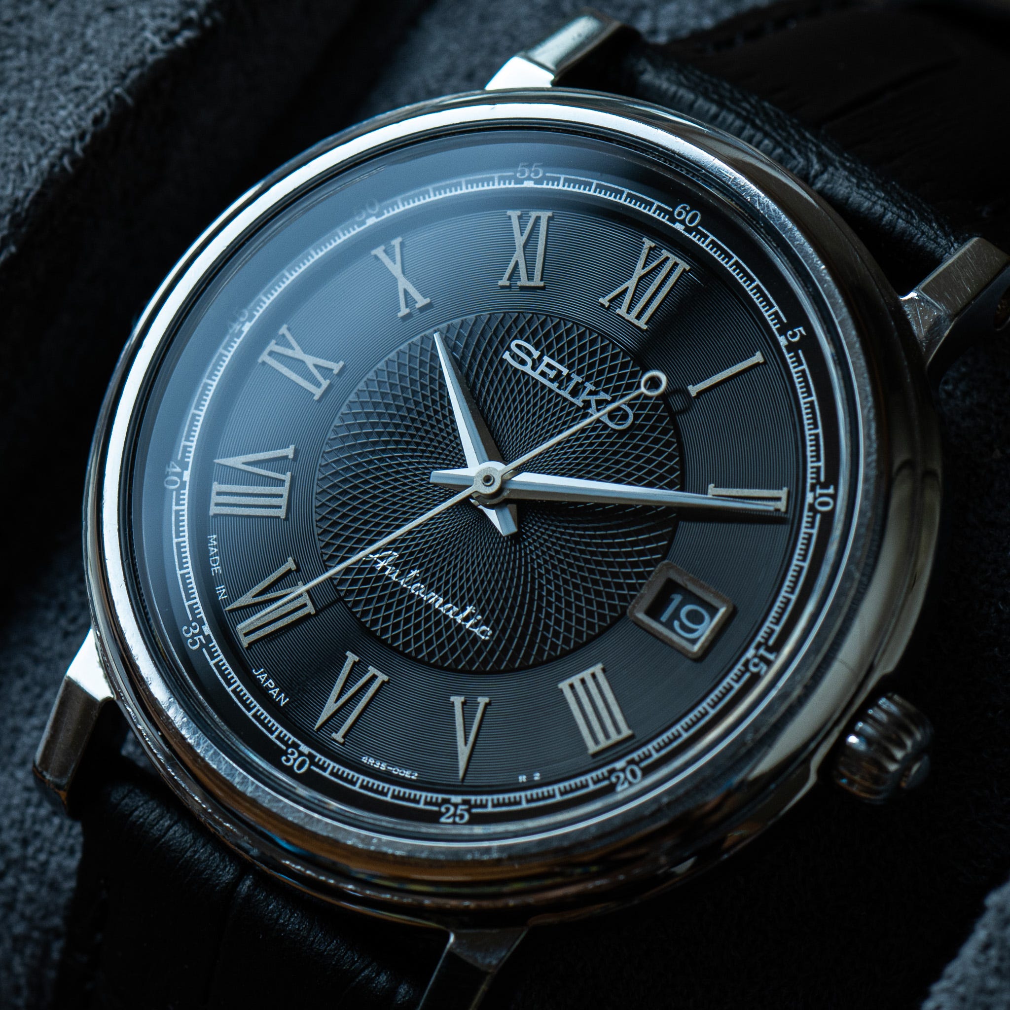
The yin to the SARY008’s yang. I’ve often wondered if these watches are the result of junior design team members getting the opportunity to create a low-risk watch. Thanks to Seiko’s fully vertical production, it wouldn’t be expensive or difficult to give younger employees a chance to oversee the design process of a small JDM release from start to finish. Like most Japanese companies, Seiko heavily promotes from within, which is how you end up with employees like Shigeo Sakai (father of the Seiko Alpinist) remaining a member of their design team for over 50 years!
Seiko 6347-5000 Automatic Moonphase
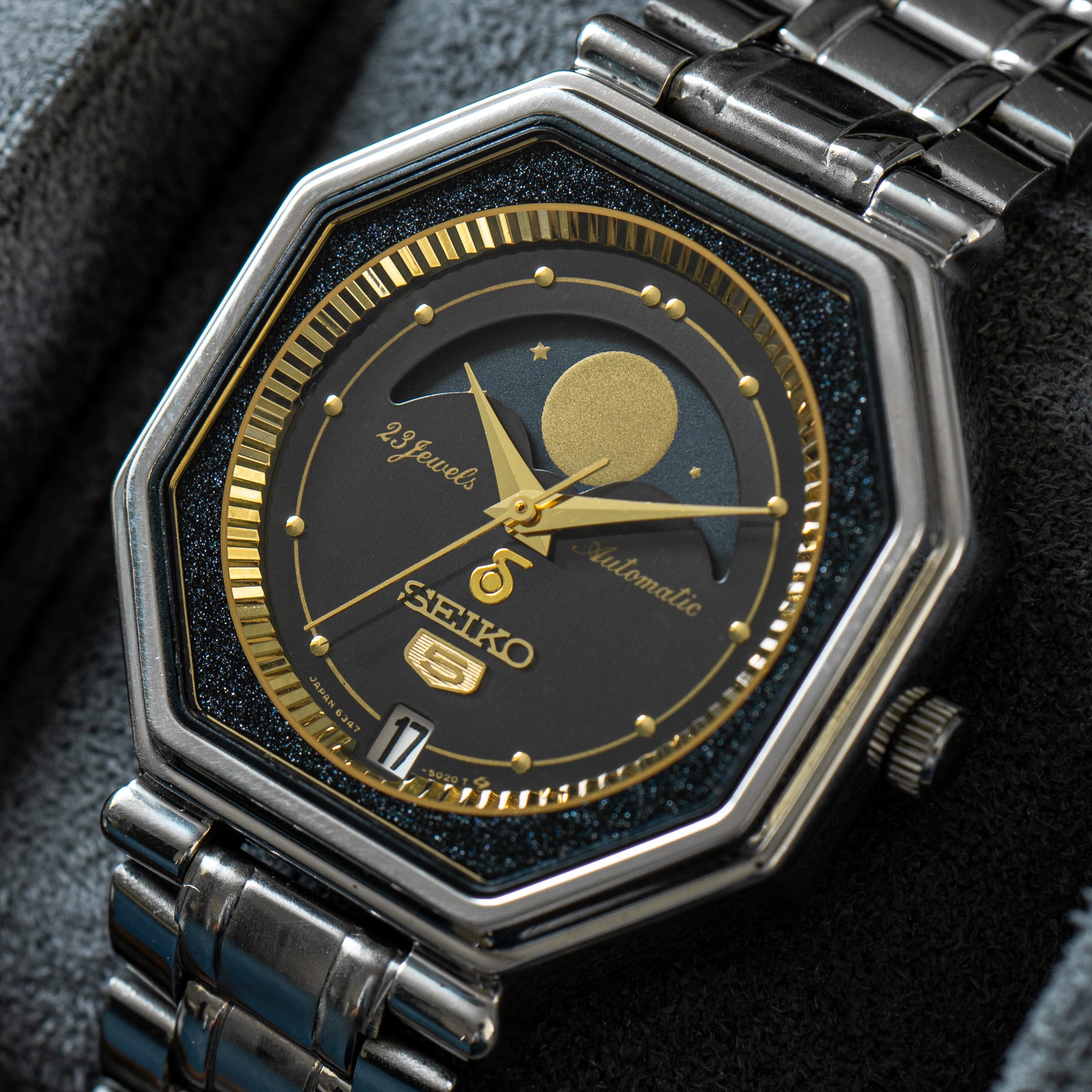
Strangely, this is the only automatic Moonphase Seiko has ever produced. It was made in 1986 and quickly disappeared from Seiko’s line-up, making this a difficult watch to track down. I know it seems like an absolute impossibility for Seiko not to have produced another automatic Moonphase in 39 years, but they haven’t. They’ve made lots of Quartz Moonphases and Kinetic Moonphases, but this unique specimen stands alone as the sole Automatic. It carries that distinction well though, with a Genta-inspired case and a layered dial setup. The starry edge sits several millimetres above the sunken dial, which is surrounded by a beautifully fluted chapter ring. In fantastic (borderline mint) condition; a true collector’s watch.
Modified Seiko 5740-0010 Lord Marvel
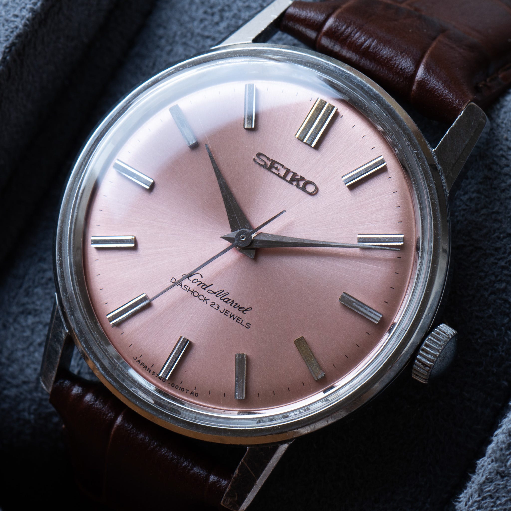
A fake dial or an interesting modification? This is a 5740 Lord Marvel from 1966, but not as it was made by Seiko. I love the work that has been done to it, and in case you’re not familiar with the original design, here’s a picture (I’m confident you’ll be able to spot the difference without needing any hints):

I would argue the difference between a fake dial and a modified dial all comes down to intent and the quality of work. Intent is the easiest element to determine - was the maker trying to create a version of the dial that replicates the original design? If they weren’t, then you’re probably looking at a modification rather than a redial. However, independent design isn’t the only thing to consider as some people are so interested in a quick sale that the speed of production surpasses the need for accuracy. In walks the second part of the sniff test - the quality of the craftsmanship.

You don’t even need to be familiar with this UG Aero-Compax to spot the fake dial. The one on the left clearly fails the test as it is both trying to look like the original, and is sloppily done.

In this zoom even needed? A stencil has definitely been used for the numbers (on the left) rather than the traditional method of pad printing or hand painting. You can see the paint bleeding around the edge of the stencil, which makes everything a bit fuzzy, especially when compared to the impressively sharp lines on the original UG dial. How about some 5740 Seiko examples that initially look great, but lose some points in the small details?

The 5740-0010 only came with a Silver Sunburst dial, so these three very obviously pass the test of not trying to replicate the original look, which is a positive start. However, all three fall at the same, perhaps overly picky, hurdle - the sunburst effect was simply painted over.

To me, the sunburst look of the steel is an iconic part of a classic 1960s Seiko. To paint over it is to radically lose the spirit of the watch. And while I confess my eyes are drawn to the heavily saturated blues and oranges of the above watches, they don’t in any way feel vintage. They look incredibly modern, and that’s a bit of a shame given they are 60 years old!
Just as a semi-irrelevant aside, I wrote a short article about identifying “aftermarket” dials by comparing the dial font to the dial code, and all three dials above (not including the pink one) fall afoul of the dial code font rule, as they incorrectly opt for the Pointed A with T dial codes.

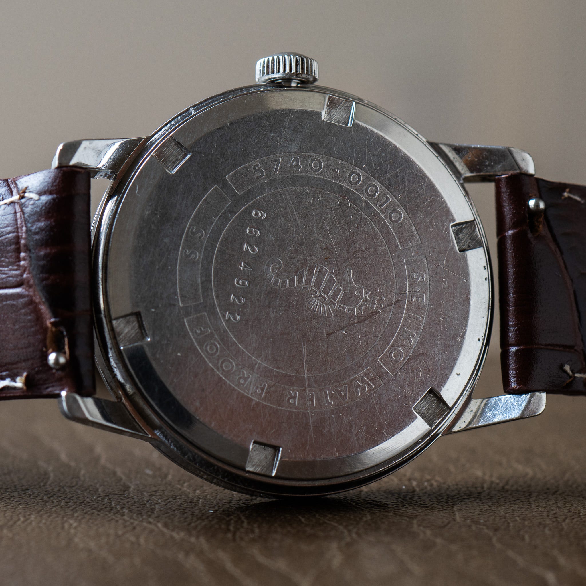
Ultimately, how you feel about a redial is totally up to you. There are very obvious pros and cons in each column, and I don’t think there’s a universally right answer. Each watch should be judged individually. How does this pink 5740-0010 sit with you? Is it something you’d consider? Here’s a picture of the incredibly cute seahorse case back to help sway you:
It’s almost back from being serviced so let me know if it’s a watch you’d like to buy.
Don’t forget to follow my Instagram to see all of the watches above in full cinematic glory later this week.